Parsons Partners with UNDP to Visualize Data on African Human Development
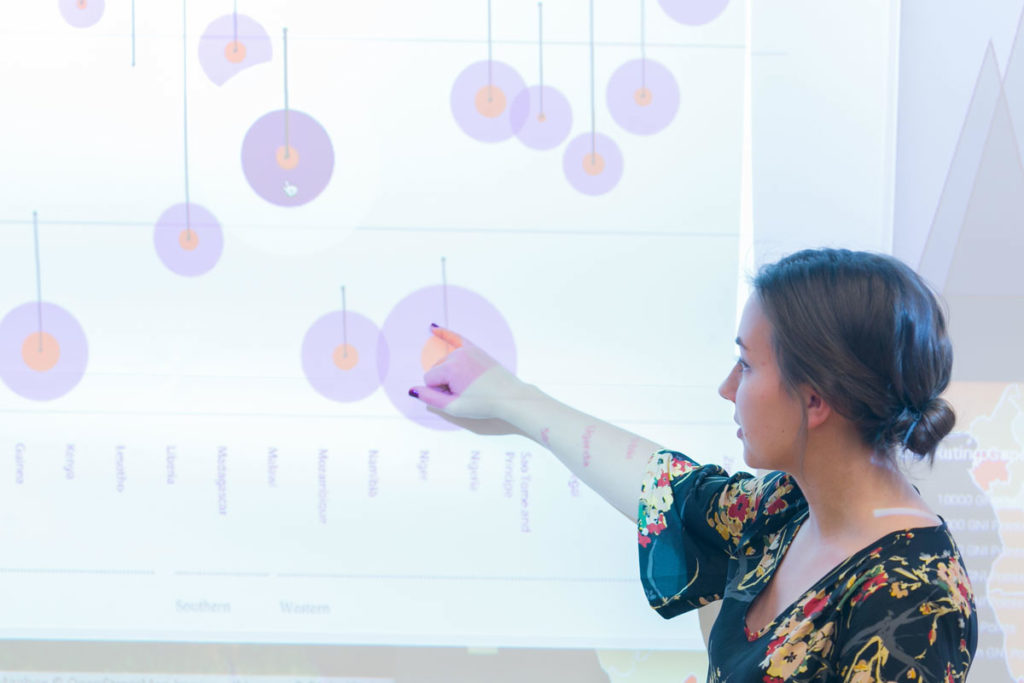
In the beginning of the fall 2015 semester, a trove of data from the United Nations Development Program (UNDP) landed on the desks of seven students in Parsons School of Design’s MS Data Visualization. The data, part of the UNDP on Africa Human Development (UNDP AfHD) annual report, revealed the impact of gender inequality on the economies of dozens of African countries.
The report’s conclusion was stark: The gender gap is costing sub-Saharan Africa $95 billion a year, “jeopardising the continent’s efforts for inclusive human development and economic growth.”
Still, to the uninitiated eye, the data was merely a collection of numbers. It was up to the MS Data Viz students to present them in a way that was aesthetically compelling, easy to navigate, and, ultimately, meaningful.
“When you have a data set like this, and you see how much work went into gathering the information, you want to do justice to it,” says Jaime Tanner, MS Data Vis ’16, an alumna who worked on the project. “As a designer, you want to make sure the data is put to good use—that it effects positive change.”
MS Data Viz students did just that: Using data published in the UNDP Africa Human Development annual report, they created striking visualizations exploring gender equality and women’s empowerment; linkages between gender equality, human development, and structural transformation; equal opportunities for economic, sociocultural, and political advancement; the influence of social norms; and legislative policies for achieving Africa’s development agenda.
The project—the first-ever partnership between the UNDP and university-level design students—encapsulates Parsons’ commitment to collaborating across disciplines, connecting with the global community, and using design as a force for social good.
“The Data Viz MS brings together visual design, computer science, and statistical analysis in the pursuit of socially engaged work,” says Daniel Sauter, associate professor of data visualization at Parsons, who oversaw the project. “When the UNDP reached out to us for help in their effort to improve the visual communication of data in the AfHD annual report, we jumped at the opportunity.”
For Tanner, it was an “intense”—and instructional—experience. There she was, in the first week of class, diving into a subject with which she was largely unfamiliar, learning how to use data visualization tools such as Javascript and p5.js “on the go,” and working for a “real client who was providing real feedback.”
Each student tackled a different data set from the UNDP AfHD report. Tanner focused on the connection between the human development index (HDI), a composite statistic of life expectancy, education, and per capita income indicators, and the pressing issue of child marriage. Using statistics gleaned from the report, she designed an interactive data visualizations that demonstrates an inverse relationship between HDI—interestingly, for both women and men—and rates of child marriage.
In creating the data visualizations, Tanner was tasked with making not only aesthetic considerations but also ethical ones.
“The numbers can be hard to conceptualize, to make sense of. You have to ask yourself, ‘How do I get the data across and connect it back to what’s it representing?’” she says. “We have to take measurements and count things, but in the process, you have to capture and communicate very important issues affecting real people.”
The partnership with the UNDP has since been integrated into the Data Visualization curriculum as the program’s first major studio. This semester, students in the studio are exploring data visualizations for the 2016 UNDP Africa Inequality Report.
Launched in fall 2015, the MS Data Visualization is a multidisciplinary program that enables students to explore and develop skills addressing the dynamic intersection of visual design, computer science, and statistical analysis. The program uniquely combines theoretical and studio-based learning to provide students with the creative and quantitative tools required to analyze and depict data.
“In today’s world, as the presentation of data has become increasingly important to shaping opinion, policy, and decision making in all sectors, data visualization is an essential tool,” says Aaron Hill, the director of the program. “The rising demand for experts to turn vast amounts of data into insight and action gives graduates of this program a very competitive edge.”
Working across design, the social sciences, and international affairs, and with real clients to communicate data related to pressing social issues, participants in the MS Data Visualization–UNDP partnership have engaged in a unique experience that will prepare them to thrive in the professional field.
“When you’re creating data visualizations, you need to go back and think, ‘What’s my audience? Who’s reading this?’” Tanner says. “Ultimately, the reason I’m doing this is to help someone. I have to make people see how powerful this data really is.”